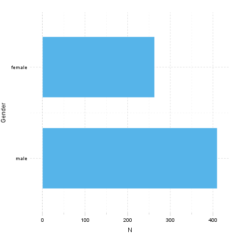
This template will return descriptive statistics of a numerical or frequency table of a categorical variable.
The dataset has 709 observations with 673 valid values (missing: 36).
| gender | N | % | Cumul. N | Cumul. % |
|---|---|---|---|---|
| male | 410 | 60.92 | 410 | 60.92 |
| female | 263 | 39.08 | 673 | 100 |
| Total | 673 | 100 | 673 | 100 |
The most frequent value is male.
This template will return descriptive statistics of a numerical or frequency table of a categorical variable.
The dataset has 709 observations with 677 valid values (missing: 32).
| Variable | mean | sd | var |
|---|---|---|---|
| Age | 24.57 | 6.849 | 46.91 |
The standard deviation equals to 6.849 (variance: 46.91), which shows the unstandardized degree of homogenity: how much variation exists from the average. The expected value is around 24.57, somewhere between 24.06 and 25.09 with the standard error of 0.2632.
The highest value found in the dataset is 58, which is exactly 3.625 times higher than the minimum (16). The difference between the two is described by the range: 42.
A histogram visually shows the distribution of the dataset based on artificially allocated frequencies. Each bar represents a theoretical interval of the data, where the height shows the count or density.
If we suppose that Age is not near to the normal distribution (see for example skewness: 1.925, kurtosis: 4.463), checking the median (23) might be a better option instead of the mean. The interquartile range (6) measures the statistics dispersion of the variable (similar to standard deviation) based on median.
This template will return descriptive statistics of a numerical or frequency table of a categorical variable.
The dataset has 32 observations with 32 valid values (missing: 0).
| Variable | mean | sd | var |
|---|---|---|---|
| hp | 146.7 | 68.56 | 4701 |
The standard deviation equals to 68.56 (variance: 4701), which shows the unstandardized degree of homogenity: how much variation exists from the average. The expected value is around 146.7, somewhere between 122.9 and 170.4 with the standard error of 12.12.
The highest value found in the dataset is 335, which is exactly 6.442 times higher than the minimum (52). The difference between the two is described by the range: 283.
A histogram visually shows the distribution of the dataset based on artificially allocated frequencies. Each bar represents a theoretical interval of the data, where the height shows the count or density.
If we suppose that hp is not near to the normal distribution (see for example skewness: 0.726, kurtosis: -0.1356), checking the median (123) might be a better option instead of the mean. The interquartile range (83.5) measures the statistics dispersion of the variable (similar to standard deviation) based on median.
This report was generated with R (3.0.1) and rapport (0.51) in 1.105 sec on x86_64-unknown-linux-gnu platform.

Logo and design: © 2012 rapport Development Team | License (AGPL3) | Fork on GitHub | Styled with skeleton