
Overview of several normality tests and diagnostic plots that can screen departures from normality.
In statistics, normality refers to an assumption that the distribution of a random variable follows normal (Gaussian) distribution. Because of its bell-like shape, it's also known as the "bell curve". The formula for normal distribution is:
$f(x) = \frac{1}{\sqrt{2\pi{}\sigma{}^2}} e^{-\frac{(x-\mu{})^2}{2\sigma{}^2}}$
Normal distribution belongs to a location-scale family of distributions, as it's defined two parameters:
Various hypothesis tests can be applied in order to test if the distribution of given random variable violates normality assumption. These procedures test the H0 that provided variable's distribution is normal. At this point only few such tests will be covered: the ones that are available in stats package (which comes bundled with default R installation) and nortest package that is available on CRAN.
shapiro.test function available in stats package.lillie.test function is located in nortest package.ad.test function in nortest package.Here you can see the results of applied normality tests (p-values less than 0.05 indicate significant discrepancies):
We will use Shapiro-Wilk, Lilliefors and Anderson-Darling tests to screen departures from normality in the response variable.
| Method | Statistic | p-value |
|---|---|---|
| Lilliefors (Kolmogorov-Smirnov) normality test | 0.168 | 3e-52 |
| Anderson-Darling normality test | 18.75 | 7.261e-44 |
| Shapiro-Wilk normality test | 0.9001 | 1.618e-20 |
So, the conclusions we can draw with the help of test statistics:
based on Lilliefors test, distribution of Internet usage in leisure time (hours per day) is not normal
Anderson-Darling test confirms violation of normality assumption
according to Shapiro-Wilk test, the distribution of Internet usage in leisure time (hours per day) is not normal
As you can see, the applied tests confirm departures from normality.
There are various plots that can help you decide about the normality of the distribution. Only a few most commonly used plots will be shown: histogram, Q-Q plot and kernel density plot.
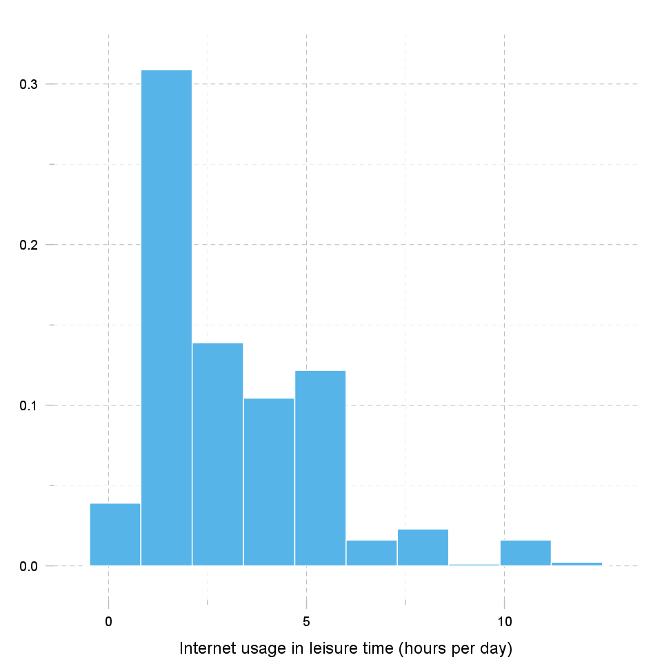
Histogram was first introduced by Karl Pearson and it's probably the most popular plot for depicting the probability distribution of a random variable. However, the decision depends on number of bins, so it can sometimes be misleading. If the variable distribution is normal, bins should resemble the "bell-like" shape.
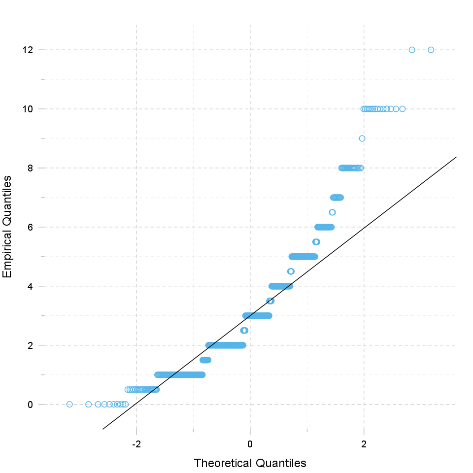
"Q" in Q-Q plot stands for quantile, as this plot compares empirical and theoretical distribution (in this case, normal distribution) by plotting their quantiles against each other. For normal distribution, plotted dots should approximate a "straight", x = y line.
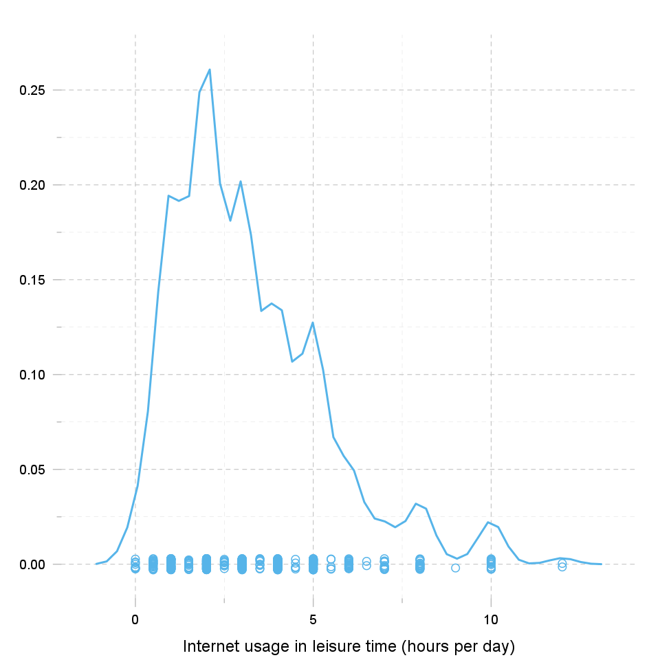
Kernel density plot is a plot of smoothed empirical distribution function. As such, it provides good insight about the shape of the distribution. For normal distributions, it should resemble the well known "bell shape".
Overview of several normality tests and diagnostic plots that can screen departures from normality.
In statistics, normality refers to an assumption that the distribution of a random variable follows normal (Gaussian) distribution. Because of its bell-like shape, it's also known as the "bell curve". The formula for normal distribution is:
$f(x) = \frac{1}{\sqrt{2\pi{}\sigma{}^2}} e^{-\frac{(x-\mu{})^2}{2\sigma{}^2}}$
Normal distribution belongs to a location-scale family of distributions, as it's defined two parameters:
Various hypothesis tests can be applied in order to test if the distribution of given random variable violates normality assumption. These procedures test the H0 that provided variable's distribution is normal. At this point only few such tests will be covered: the ones that are available in stats package (which comes bundled with default R installation) and nortest package that is available on CRAN.
shapiro.test function available in stats package.lillie.test function is located in nortest package.ad.test function in nortest package.Here you can see the results of applied normality tests (p-values less than 0.05 indicate significant discrepancies):
We will use Shapiro-Wilk, Lilliefors and Anderson-Darling tests to screen departures from normality in the response variable.
| Method | Statistic | p-value |
|---|---|---|
| Lilliefors (Kolmogorov-Smirnov) normality test | 0.168 | 3e-52 |
| Anderson-Darling normality test | 18.75 | 7.261e-44 |
| Shapiro-Wilk normality test | 0.9001 | 1.618e-20 |
So, the conclusions we can draw with the help of test statistics:
based on Lilliefors test, distribution of Internet usage in leisure time (hours per day) is not normal
Anderson-Darling test confirms violation of normality assumption
according to Shapiro-Wilk test, the distribution of Internet usage in leisure time (hours per day) is not normal
As you can see, the applied tests confirm departures from normality.
There are various plots that can help you decide about the normality of the distribution. Only a few most commonly used plots will be shown: histogram, Q-Q plot and kernel density plot.
Histogram was first introduced by Karl Pearson and it's probably the most popular plot for depicting the probability distribution of a random variable. However, the decision depends on number of bins, so it can sometimes be misleading. If the variable distribution is normal, bins should resemble the "bell-like" shape.
"Q" in Q-Q plot stands for quantile, as this plot compares empirical and theoretical distribution (in this case, normal distribution) by plotting their quantiles against each other. For normal distribution, plotted dots should approximate a "straight", x = y line.
Kernel density plot is a plot of smoothed empirical distribution function. As such, it provides good insight about the shape of the distribution. For normal distributions, it should resemble the well known "bell shape".
This report was generated with R (3.0.1) and rapport (0.51) in 2.401 sec on x86_64-unknown-linux-gnu platform.
Logo and design: © 2012 rapport Development Team | License (AGPL3) | Fork on GitHub | Styled with skeleton