This template will check if provided variable has any outliers.
An outlying observation, or outlier, is one that appears to deviate markedly from other members of the sample in which it occurs. There are several ways to detect the outliers of our data. However, we cannot say one of them is the perfect method for that, thus it could be useful to take different methods into consideration. We present here four of them, one by a chart (a Box Plot based on IQR) and three by statistical descriptions (Lund Test, Grubb's test, Dixon's test).
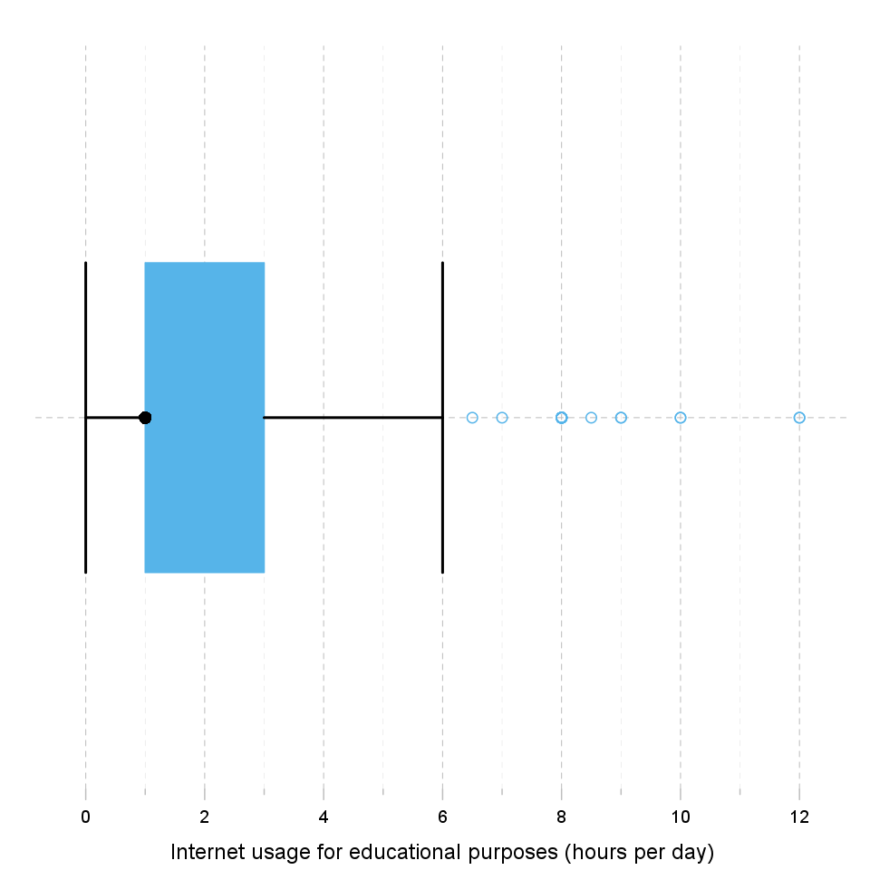
Among the graphical displays the Box plots are quite widespread, because of their several advantages. For example, one can easily get approximately punctual first impression from the data and one can visually see the positions of the (possible) outliers, with the help of them.
The Box Plot we used here is based on IQR (Interquartile Range), which is the difference between the higher and the lower quartiles. On the chart the blue box shows the "middle-half" of the data, the so-called whiskers shows the border where from the possible values can be called outliers. The lower whisker is placed 1.5 times below the first quartile, similarly the higher whisker 1.5 times above the third quartile.
It seems that 4 extreme values can be found in "Internet usage for educational purposes (hours per day)". These are: 10, 0.5, 1.5 and 0.5.
The above test for outliers was based on lm(edu ~ 1):
| Estimate | Std. Error | t value | Pr(>|t|) | |
|---|---|---|---|---|
| (Intercept) | 2.048 | 0.07797 | 26.27 | 7.939e-105 |
Grubbs test for one outlier shows that highest value 12 is an outlier (p=0.0001964).
chi-squared test for outlier shows that highest value 12 is an outlier (p=7.441e-07).
This template will check if provided variable has any outliers.
An outlying observation, or outlier, is one that appears to deviate markedly from other members of the sample in which it occurs. There are several ways to detect the outliers of our data. However, we cannot say one of them is the perfect method for that, thus it could be useful to take different methods into consideration. We present here four of them, one by a chart (a Box Plot based on IQR) and three by statistical descriptions (Lund Test, Grubb's test, Dixon's test).
Among the graphical displays the Box plots are quite widespread, because of their several advantages. For example, one can easily get approximately punctual first impression from the data and one can visually see the positions of the (possible) outliers, with the help of them.
The Box Plot we used here is based on IQR (Interquartile Range), which is the difference between the higher and the lower quartiles. On the chart the blue box shows the "middle-half" of the data, the so-called whiskers shows the border where from the possible values can be called outliers. The lower whisker is placed 1.5 times below the first quartile, similarly the higher whisker 1.5 times above the third quartile.
It seems that 4 extreme values can be found in "Internet usage for educational purposes (hours per day)". These are: 10, 0.5, 1.5 and 0.5.
The above test for outliers was based on lm(edu ~ 1):
| Estimate | Std. Error | t value | Pr(>|t|) | |
|---|---|---|---|---|
| (Intercept) | 2.048 | 0.07797 | 26.27 | 7.939e-105 |
This report was generated with R (3.0.1) and rapport (0.51) in 1.082 sec on x86_64-unknown-linux-gnu platform.